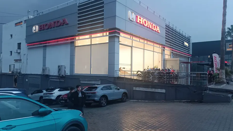
"How big should the letters be?" is one of the first questions in any sign project – and one of the most important. Too small, and the sign is missed or unreadable from the street. Too large, and it overwhelms the facade or exceeds what local rules allow. This guide gives a practical metric chart, explains the legibility research behind it and lists the factors that move the answer up or down.
The legibility index in one paragraph
Sign legibility research, notably by the United States Sign Council (USSC), expresses readability as a legibility index (LI): the distance at which a letter can be read for each unit of letter height. USSC works in feet per inch. Converted to metric:
- LI 30 (30 ft per inch) ≈ 3.6 m of reading distance per cm of letter height – a value used for good conditions with clear, high-contrast, mixed-case lettering.
- LI 20 (20 ft per inch) ≈ 2.4 m per cm – a more conservative value for busier environments, less ideal fonts or lower contrast.
To find a minimum letter height, divide the viewing distance by the LI value. The USSC also advises increasing the height by about 15% for text in all capitals, because words in capitals are harder to recognise than mixed-case words of the same height.
Letter height and viewing distance chart
The chart below shows minimum height for mixed-case text (the height of capital letters) based on the two LI values above.
| Viewing distance | Min. letter height – LI 30 (good conditions) | Min. letter height – LI 20 (busy environment) |
|---|---|---|
| 10 m | 2.8 cm | 4.2 cm |
| 25 m | 6.9 cm | 10.4 cm |
| 50 m | 13.9 cm | 20.8 cm |
| 75 m | 20.8 cm | 31.3 cm |
| 100 m | 27.8 cm | 41.7 cm |
| 150 m | 41.7 cm | 62.5 cm |
| 200 m | 55.6 cm | 83.3 cm |
These are minimums for reading, not targets for impact. A sign that should be noticed from a distance, stand out among neighbours or be read in a few seconds from a moving car usually needs more.
Reading distance is not the same as viewing distance
For pedestrians, the distance to the sign is a good guide. For drivers, what counts is time: the viewer has to notice the sign, read it and react – for example by braking or turning – before passing it. USSC's worked examples assume a reaction time of around 10 seconds. At higher speeds, a car covers much more distance in that time, so the sign must be readable from much further away. That is why letters for roadside and retail-park signs are often far larger than the chart minimum.
Factors that change the right height
Contrast
Dark letters on a light wall, or bright letters on a dark facade, are read from much further than letters close in tone to the background. Brushed stainless on light stone, for instance, has low contrast in daylight. If contrast is limited, increase the height or choose a finish that stands out – see our material guide.
Font and stroke width
Simple, open typefaces with clear letter shapes read best. Very thin strokes, condensed fonts, scripts and decorative typefaces need more height. Very bold fonts can also suffer at a distance when the counters (the open spaces inside letters like "e" and "a") fill in visually.
Letter spacing and layout
Tight spacing makes words blur together from far away. Leave enough space between letters and around the text, and keep the message short.
Illumination
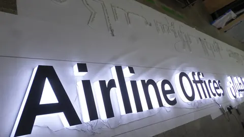
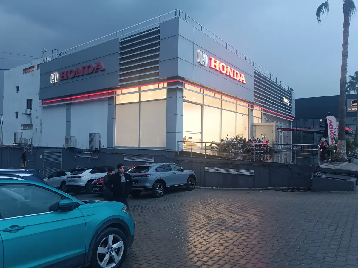
At night, an illuminated sign is the only thing that can be read. Face-lit letters project the shape most directly; halo-lit letters read as a silhouette against the wall and benefit from good contrast and a little more size. See channel letter types for the differences.
Position and angle
Signs mounted high or viewed at a sharp angle look smaller than they are. A sign on a side street seen mostly at an angle may need larger letters than one seen straight on.
From chart to real sign
- Determine the main viewing distance – across the street, from the car park entrance or from the road.
- Choose an LI value – LI 30 for good conditions, closer to LI 20 when the environment is busy or contrast is limited.
- Calculate the minimum height and add about 15% for all-caps text.
- Check the facade and local rules – fascia size, proportions and any size limits in local regulations.
- Mock it up. A full-size paper print on the facade, viewed from the real distance, is a quick and reliable check.
Letter height also influences construction. Larger letters generally get a deeper return, and our profiles let you choose the return depth to suit the letter size – for example the 4, 6, 8 or 10 cm side band on SML 5 ECO. Include the height and total length in your quote request; our guide on what to send with a quote has the full checklist.
Frequently asked questions
How tall should letters be to read from 50 metres?
Using the USSC legibility index, about 14 cm for good conditions (LI 30) and about 21 cm for a busier environment (LI 20), measured as capital letter height for mixed-case text. Add around 15% for text in all capitals.
What is the legibility index?
The legibility index (LI) expresses how many units of reading distance each unit of letter height provides. USSC uses feet per inch; LI 30 corresponds to about 3.6 metres per centimetre.
Do capital letters need to be bigger?
Yes. The USSC recommends increasing letter height by about 15% when text is set entirely in capitals, because capital-only words are harder to recognise.
Does illumination change the letter height I need?
It changes how well the letters read at night. Face-lit letters read most directly; halo-lit letters appear as a silhouette and benefit from strong contrast and a bit more height.